Design Tips for Developers

So you're a developer, but you have enough of an artistic eye to realize that your work could look a little better if only you knew more about design. You'd like for your work to look nicer, but all that fuzzy feelie artistic jargon makes you uncomfortable. I can help with that. One thing that will help is that design is a visual language, and yes, it is a language, just like French or C. Once you understand a little and are able to read it, you'll find yourself being able to speak it. Like any good language there is structure and some reasoning behind it and I'd like to give you a few pointers.
Tip Zero - Define
So where to begin? I would say that the absolute first thing is to define your restrictions. This seems counter to a lot of people who think that being artistic is free and open and without limitations, like some butterfly in a field. Well that's not true. Even a blank slate is limited to the slate. Understanding what the constraints are will fuel creativity. You'll know most of these already from the specs for the project; Is it an app? iPhone, Android or both? A website that needs to be IE9 compatible? Any and all of these will define what various parts of you design should look like.
I'm sure at this point you're already like "Well, duh!" And it's true, this does seem basic and common sense, but that's the point. You need to actually do the basic and common sense things first! Otherwise you'll find yourself straying off point and spinning your wheels. When you get stuck - and you will get stuck - you can refer back to the limitations of the project and it will help you get back on track. After getting the specs let's add a few constraints of our own.
The first thing most people will jump to is color, but don't. Color should be the last thing you worry about when designing something. A good design needs no color, you should be able to have everything in black and gray. Color is the parsley sprig on the plate, not the steak. A bad design will only be made worse by the addition of color, so don't worry about it for now.
You should worry about the typography. Words will make up a great deal of any design, which is why there is so much attention given to it. You will see and hear a lot of opinions about font choices and such, don't listen. At least not to start. The only things you need to worry about at the offset are hierarchy and serifs. Let's start with hierarchy since it's easier and another one of those "duh!" points. It's inherent in writing. It comes naturally, your job is to manipulate it to get it to do what you want. I'm a big fan of defining and using the rem value as the "base" for the typography system. Don't go lower than 16px, no matter what anyone says. I'm old, my eyesight is going. I can't read 8px font. It's going to happen to you too. 16px is a good size because it's legible at a reasonable distance and renders well on all screen sizes. It also has the added benefit of being a round number, which comes in handy in defining the hierarchy. To get it you simply multiply the base size by a ratio - I like to use the golden ration of 1.618 just because. To make life easier, there is this site, Type Scale, that does the math for you. If you're not a golden ratio kind of person, you can use another scale. Boom! Now you have a nice little hierarchy that makes it obvious what's important and what isn't.
One small side note: Title is not the same thing as h1. If you read the HTML specs, you'll note that an h1 tag is to denote a headline. It is perfectly and semantically acceptable to have multiple h1 tags on one page. Unfortunately, it would seem that some forgot to read that portion of the spec which is why most sites use the h1 as a title. The difference is that an h1 should adhere to your chosen font, while a title can be of a different font and size. Look at any newspaper in the country ( since most typography rules come from them anyway, ) is the name ( title ) of the newspaper the same as the headline ( h1 )? Most of the time it is not. For this reason a title can be a different size, color and font as the rest of your design.
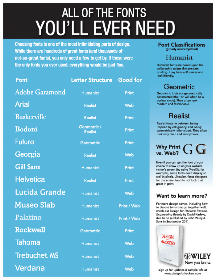
Now we can move on to serif, or lack thereof. The choosing of a font seems to cause the most anxiety in people. There are a lot of font nerds out there that have all kinds of ideas about which font should be used and how. They have great insight and it's very easy to go down the rabbit hole of font types, but you can simplify all of the choices down to only one. Serif or Sans-Serif. I'll admit though, that even that choice can be subjective. There are some guidelines that you can follow to help you along. Sans-Serif fonts are generally modern, while Serif fonts are generally classic. Mixing the two is also acceptable, but stick to one type for each size in your hierarchy. That is to say, don't have h1 tags be serifed on one content and sans-serif in another. Using the system default fonts is perfectly acceptable as well. Believe it or not, both Apple and Microsoft employ highly paid designers to figure out what system fonts to use. Much like we define an rem value, the system font is our base. Partially because it is the fallback when the chosen font can't be loaded ( font-family: "My Killer Font", serif ).

Good artists copy; Great artist steal
Here's a secret for you - We are all thieves. Art, writing and especially the software industry is built on stealing ideas. Here's another quote for you:
There are no original ideas
OK, maybe it's a paraphrase, but that doesn't change the sentiment. We've gotten where we are by building on the works of other. If we had to recreate everything from scratch every time, we'd still be in caves hammering out the wheel time and time again. If calling it stealing makes you uncomfortable, then call it "research." Create a folder on your computer, open your browser and Google your competitors. Find out what the other guy is doing, take the good bits and save them in the folder. It can be handy to save the bad bits as well, they can help you down the road. In fact, at this stage, it's probably a good idea to just grab as much as possible since you don't know what will come in handy in the future. After that hit Pinterest. Pinterest is great for theft/research because thousands of other people have been doing it for you and categorizing it so you don't have to. Not only that, but designers freely put their work there for you to look at. For web design theres the AWWWards, a curated showcase of websites doing some of the best work out there. Behance is another great resource although it can be hard to navigate since it includes design and art. Some people like to peruse Dribble, I wouldn't recommend it to start. There's a lot of bad design on there hiding behind shinny Photoshop renderings and it would be easy to be led astray.
Don't skip this step, even if you have a solid idea of what you want your design to look like. Seeing different ideas and designs will expand your "design vocabulary" and help you in the future. Much like reading books, looking at lots of art and design will expand your mind. Remember how I said design is a language? This is what I was talking about.
Tip C - Bits and pieces
Since we're programmers we need to look at the logistics as well as the design. Looking back at our specs - you do have specs don't you? - break out all of the individual pieces that you'll need to make it work. Do you need forms? Will buttons contain large amounts of text? Will thumbnail images be used? This is the basis of atomic design, an awesome concept that I first heard of from Brad Frost. The idea is simple and revolutionary in its simplicity. Since we - as pragmatic programmers - don't like to repeat ourselves in our code it makes little sense that you should repeat yourself in your design. Need buttons on the loading page, the sign up page and the contact form? They should all be - more or less - the same. It gives things continuity. Remember, design is a language and as such you can't change up the definitions as you go along.
A very good practice is to create a style sheet. This can be a page on a website, an app screen or simply a piece of paper. What's important is to define all the bits and pieces on there and then style them. You'll use this as a reference, so have it somewhere handy so you can look at it often. For Drupal there is the the Style Guide Module which creates a page with every conceivable element. Use this for the base. Once the style guide page looks good - and more importantly - consistent, you've done 90% of the work.
Tip Delta - The search for spaceOne very common issue with most designs is space. More specifically the lack thereof. It seems that most of us want to cram everything on one screen and not have to scroll - at least when designing/developing. I'm not sure where this comes from - it seems to be psychological - but it's quite common. If you look at some of the 'cutting edge' designs you'll notice that there is a lot of space. You should emulate this as well. Things need room around them, they need a buffer, especially things that are of the same kind. This happens most often with topbar menus. The client, the marketing department and the clients father-in-law all want direct links to what they perceive to be the most important piece of the whole design. It won't work however, and - again - we need to introduce some restrictions. Three links in the topbar is sufficient for most sites ( Also it's an odd number - see side note below, ) but if you need more, try to limit it to five. Any more than that and things start being crowded, especially once the screen sizes start getting smaller.
Side note
Why odd numbers? I'm sure there's volumes written about why odd numbers are more visually appealing so I'm not going to go into it. As someone who is really fond of symmetry this felt - at first hearing of it - counter intuitive. It makes it especially difficult because most development things are based on even numbers and odd numbers don't divide nicely. Visually though, the eye likes odd numbers and I suspect that it has to do with how the number in the center looks like a fulcrum holding up the sides. So when ever you are faced with a list of things you need to display, try to lay them out in an odd number - especially things that are horizontal - like a menu.
Keep your space consistent as well. If you have 2rem of padding at the bottom of the first section, don't change it to 2.5rem on the next. The spacing between elements creates a rhythm, and people will balk subconsciously if the rhythm changes. It's especially important to maintain consistent spacing when it comes to paragraphs and text blocks. Reading relies heavily on the way the text is laid out, improperly spaced text is uncomfortable to read. You need to think about the rhythm vertically and horizontally. Changing how much space there is to the left or right of an element changes it's importance and how much it stands out on the page. With text that is related - say the paragraphs in an article - you want the space on the left to be the same for each. This applies to things like images, if it's inside of the text, it will look better if the sides are flush with the paragraphs.
There's a lot more I could write, but I'm going to leave it off here. If you would like to find more information there are near infinite resources at your fingers. Lately I've been reading the newsletter from Hack Design, but there are tons of other resources as well. Look around, experiment a little, expand your vocabulary.
Want to talk about how we can work together?
Ryan can help


