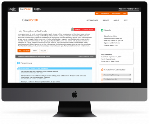
CarePortal Care Center Case Study
Global Orphan is an international organization that specializes in helping children and families around the world get the help and support they need.
Discovery and Design
Global Orphan had previously worked with us to complete an existing Laravel project that had been over budget and behind schedule at their previous developer. Upon launch of the new CarePortal app, thousands of churches, communities, agencies and users were able to help meet the needs of families and foster children across the country.
Coming off of this successful launch, Global Orphan began to study user engagement on their system, and created a roadmap that would allow churches to take a more prominent role in fulfilling requests in their communities through the creation of CareCenters. Coupled with this new church role, Global Orphan saw the need for anyone, regardless of location and church status, to be able to help meet needs in their community and abroad. It was this vision that prompted development of the CareCenter functionality.
Since we completed the previous iteration of the CarePortal Laravel app, our team was well versed in the functionality of the system. We met with Global Orphan to plan out the project, spending time on discovery to ensure that every workflow, data model, role, and action was once again accounted for. This was an absolutely necessary step for the project, ensuring that all components remained operational, given that the existing app had a massive codebase and functionality. After discovery was complete, we met again to discuss our outline, gathered feedback, and signed a formal work agreement to begin work on the application.
Buildout
Through the discovery, we planned the buildout and outlined every update that needed to be deployed, ensuring that new functionality would maintain and compliment existing workflows. We organized all work according to role and data model, so that specific models and roles that contained similar functionality would be tackled at the same time, thus cutting down on extra work down the road. Work was broken out by ticket and assigned in 2-week sprints, with client meetings occurring weekly to showcase progress and discuss new functionality.
Our first step in development was creating the infrastructure allowing churches to be upgraded to CareCenters. We then expanded existing functionality to allow CareCenters to commit to meeting specific requests in their community. We focused on expanding system roles, allowing anyone, anywhere, to help meet needs. Since this was new functionality in the system, our developers spent a considerable amount of time working through the existing workflows while signed in as the new Community Responder role. Emails were tweaked and additional logic was written to correctly respond to these newly expanded roles.
Part of the CareCenter scope of work was also retheming the main request engagement page. Previously, the page served as a simple informational landing page for church members. Functionality was limited, and unimportant details were featured prominently. With the redesign, we placed the most important details front and center, allowing users to immediately feel engaged with the need. We also built out new functionality allowing anyone to easily interact and fulfill the need. A new user-friendly login/signup process was created, which also created the foundation for an eventual rollout of expanded church member accounts in the future.
Lastly, we created a new engagement brick for careportal.org, allowing CarePortal to more easily capture user information and import it into their system, enabling new users to easily interact with the entire CarePortal system.
Throughout the buildout process, our project managers QA’d features and functionality on the website as they were created and pushed to our development server. We regularly handed off sections of the site to the client for QA, ensuring that everyone had tested and signed off on the style changes prior to launch. Once features were verified, they were pushed to a second server in a live testing environment for an additional round of testing. We also created pipeline tests that ran prior to every code merge, ensuring that all new functionality wouldn’t affect existing workflows and procedures.
Launch
The new CareCenter functionality of the CarePortal app delivers a fully functional experience geared towards allowing anyone, anywhere, to help meet needs in their community. It also enables churches to take a more prominent role in their community, becoming advocates for positive change. New roles were created and functionality was expanded across the board, ensuring that people in need get help in a quick and timely manner. Churches and individuals are more engaged and able to create a better community for everyone. CarePortals new app elevates their brand, positioning them as a unique and important player in communities across the country. Countless family's lives will be improved daily through their efforts.
Objectives
- Buildout functionality to allow anyone, anywhere, to help meet foster needs through the CarePortal System
- Create workflows allowing churches to take on additional responsibilities to meet needs in their community
- Build out a foundation allowing church members to have full user accounts in a future iteration
- Re-theme Request pages so that pertinent information is showcased better, allowing easier fulfillment of needs
- Create a new engagement brick on the front page of Careportal.org, capturing user information and allowing them to more easily meet requests in the future.
- Integrate functionality that will support communication between thousands of community responders and CareCenters across the country
Core Solutions
Integrations
- Custom zip code radius integration through Google’s maps API allowing for highly selective request notifications
- Git pipelines and tests to ensure new functionality doesn’t break existing code
Open Source
- Utilization of site-wide Laravel and Blade templates
- Comprehensive email functionality testing through available OS services
Responsive
- Seamless functionality across all platforms and multiple screen sizes
- Updated design aligning with brand standards
Want to talk about how we can work together?
Ryan can help
