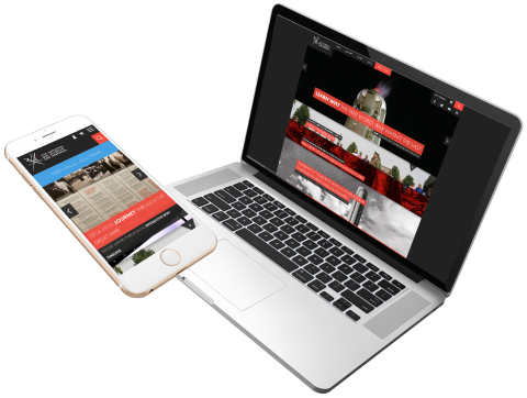
National World War I Museum Case Study
The National WW1 Museum and Memorial is America’s official WW1 museum, located in Kansas City, Missouri. It is home to the most comprehensive collection of WW1 objects and information in the world, and serves to educate the public of the wars enduring impact on the global community.
Discovery & Design
The WW1 Museum came to us with an existing site design and branding, though it lacked mobile scalability and functionality. With the mobile-first focus of consumers, having the ability to effectively communicate on mobile devices was a key feature they needed. In addition to adapting the website to mobile phones, they decided to integrate Tessitura, a third-party ticketing system, into their website to better serve their clients.
The biggest challenge facing us was maintaining the current desktop design over hundreds of pages while converting the code to scale across multiple screen sizes. We also had the challenge of integrating a shared session from Tessitura’s external account pages into the current website to display cart and login information.
Since the primary focus of this project was adding mobile scalability to the website, our designers took the existing branding of the desktop site and designed a mobile experience that seamlessly maintained the theme of the mobile site. Custom mobile menus, mobile-friendly sliders, custom CTA’s and content were all factored into the UX design. We then took those existing and updated styles and applied them to the Tessitura designs, so continuity would be maintained.
Buildout
When Code Koalas began to build out this project, we adopted a strategy to first replicate their existing desktop design with updated responsive styles. Normally mobile design would be tackled first, but given that they had an existing theme that they wanted to maintain, we focused on consistency first. Once the website had basic scalability and the new desktop experience was consistent with their current site, we then focused on the necessary tweaks to create an excellent mobile experience. Our developers worked to implement new mobile menus, custom mobile CTA headers and notifications, as well as updating portions of the existing code to be mobile compatible. Our goal in this was to effectively showcase content that was important in a consistent and natural way.
We also began to integrate the Tessitura network into the existing site by creating several custom Drupal modules that safely relayed information from Tessitura to the main site. New cart and account icons were added to the menus, populated with information from Tessitura. Tessitura’s styling was also updated to match the branding of their main site.
All throughout the build process, code was pushed daily to a secure staging site where our project managers QA’d updates on a daily basis, communicating progress with the WW1 Museum via emails and weekly meetings. Staff at the WW1 Museum were able to see progress on the staging site through the process, and provide instant feedback on feature implementation and UX testing.
For the WW1 Museum, this process helped them evolve their initial plan for displaying hours on the website from a static display to a dynamic custom module with the added ability to provide specialized information in the event of a closure.
Launch
The new WW1 site delivers a solid, natural experience across all screens. Staff are now able to more effectively connect and communicate with visitors in new ways. User experience is dramatically improved, and the Tessitura integration gives visitors a single integrated portal for tickets and donations. The new site elevates the World War 1 Museum as the definitive resource for all historical information pertaining to the war.
Moving forward:
Sites evolve, culture shifts and requirements change. That’s why we don’t just focus on delivering an excellent site - we also focus on maintaining an ongoing relationship with our clients. We continue to provide support for the WW1 Museum and work to ensure that any future needs or feature build outs are handled quickly and professionally
Objectives
- Improve scalability of the existing website across different environments
- Create a user-friendly screen first mobile experience
- Integrate the Tessitura network into the core functionality of the website, while maintaining consistent design
- Improve consumer interaction through updated mobile notifications
- Solidify and update codebase for improved reliability
Core Solutions
Integrations
- Integration of the Tessitura network for ticketing / donation portal, through the creation of a shared session between their API and the WW1 site
Drupal
- Custom modules allowing for new admin interactions
- Interactive alerts and CTA’s across the site
- Improved stability through a consistent code base
Responsive
- A fully responsive website across all screens.
Want to talk about how we can work together?
Ryan can help
