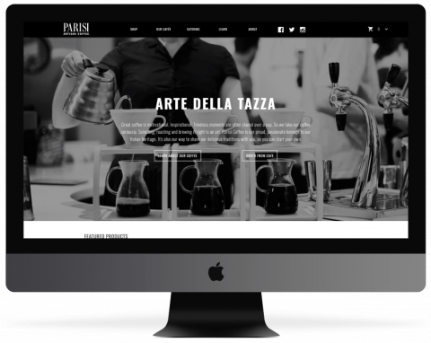
Parisi Coffee Case Study
Parisi Coffee is a Kansas City-based roastery that specializes in creating the best coffee experience in the market. Through local community cafes and an online store, they are positioned to be an industry leader in the national market for years to come.
Discovery & Design
Parisi coffee came to us with an existing, fully functional website that was visually out of date and non-responsive. Due to an expanding presence in the Kansas City market, and an increase of mobile traffic, having an updated website that could showcase all of their products on any device was essential to their continued growth.
Our team met with Parisi to plan out the project. Based on their brand guidelines and specifications, we created a dynamic design over multiple pages and content types. We then presented the new design to Parisi and tweaked it based on their feedback.
Buildout
Through comprehensive discovery, we planned the buildout and outlined every content type, site-wide component, and page that needed to be rethemed. We then organized these components into manageable sprints that could show frequent progress to the client. Careful planning and management had to be done to ensure that goals and timelines were met.
Step one of the development was applying basic sitewide style updates. We then rethemed each individual component, carefully testing to ensure that designs remained consistent across devices. Once individual components and content types were successfully showcased and passed our internal QA, we focused on tweaking the remaining individual pages.
As we worked through the retheme, we found a significant amount of code that was impairing the speed of the site. After speaking with the client, we added the additional task of rewriting antiquated code to increase functionality and response time. We also tested all existing and new functionality and workflows, ensuring that every aspect of their site functioned correctly throughout the retheme.
Throughout the buildout process, our project managers QA’d features and styles on the website as they were created and pushed to our development server. We regularly handed off sections of the site to the client for QA, ensuring that everyone had tested and signed off on the style changes prior to launch.
Launch
The new Parisi site delivers a modern, responsive website that gave them a competitive edge in the marketplace. Response time and user experience are improved, and all existing e-commerce workflows remained consistent to ensure a seamless client and consumer transition. Parisi’s new website elevates their brand, positioning them to be an important player in the Kansas City market for years to come.
Objectives
- Retheme the existing Parisi website to provide an updated customer experience
- Ensure that all pages are mobile friendly and scaled correctly across all devices
- Increase speed and reliability of core web functions
- Maintain existing e-commerce workflow
Core Solutions
Integrations
- Drupal Commerce integration allowing for a dynamic consumer experience
- Shipping pricing and functionality integration through Commerce
Mobile Apps
- Updated design aligning with brand standards
Responsive
- Seamless functionality across all platforms and multiple screen sizes
Want to talk about how we can work together?
Ryan can help
